Media Queries and Responsive Design
Styling your site to look different depending on the size of a screen it is being viewed on is known as responsive web design. In web design, the screen being used to view a site is commonly referred to as a viewport.
Goal
Follow along to learn:
- What makes a site responsive
- What are media queries
- How to use media queries to make a website responsive
Making a Site Responsive
To make sites responsive we can use CSS media queries. A media query is a block of CSS that is applied only when certain conditions about the user’s viewport are true. For example, CSS in a media query that defines a maximum width of 500px would only be applied when the user’s viewport width is at or below 500 pixels.
Let’s walk through creating media queries. This will allow us see what they look like in action. Code along if you’d like.
The website file structure should look something like this:
File Structure
media-query-practice
|- main.css
|-index.html
Let’s add some starter HTML:
index.html
<!DOCTYPE html>
<html lang="en">
<head>
  <meta charset="UTF-8">
  <meta name="viewport" content="width=device-width, initial-scale=1.0">
  <meta http-equiv="X-UA-Compatible" content="ie=edge">
  <title>Media Queries</title>
  <link rel="stylesheet" href="main.css">
</head>
<body>
  <div class="container">
    <main>
    <h1>Media Queries</h1>
    <div class="row">
        <div class="row__col">
          <p>
            Media queries allow us to make our sites <em>responsive</em>.
            We can use media queries to apply CSS styling only when certain conditions apply.
            For example, our sites can look different depending on the size of the screen, or <em>viewport</em> a user is viewing our content with.
            We can also change the way our site appears if a user is printing our website, or using a screen-reader.
          </p>
        </div>
        <div class="row__col">
          <p>
            Using media queries and responsive design allows us to ensure that our site looks and works great no matter <em>how</em> the user is viewing it.
            And, as more and more people use more and more devices to browse the internet, integrating media queries into websites is becoming a common, widespread practice.
          </p>
        </div>
        <div class="row__col">
          <p>
            Media queries are awesome!
          </p>
        </div>
      </div>
    </main>
  </div>
</body>
</html>
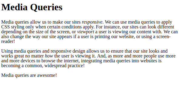
If we load our index.html file in the browser, it should currently look somewhat like this:

Now that we have a basic site in place, let’s add media queries.
Media queries are located in CSS stylesheets. Because CSS cascades, they should be located at the bottom of the file, to prevent other style rules from overriding them.
They begin with @media, and contain a set of parenthesis and curly braces, like this:
main.css
-
The @media portion tells the browser that this is a media query.
-
The parenthesis will eventually define when the CSS in this block should be applied to our site.
-
The curly braces will eventually contain the CSS that will be applied when the conditions we define are true.
Media queries often have something called a media type. A media type refers to the type of media-viewing device the user is viewing our site with. We have the following options to choose from:
-
all: Refers to any and all devices.
-
print: Refers to viewing our site in “print preview” mode. For example, if we had a website with a dark-colored background that users may want to print, we could use a print media query that removes the dark-colored background for print media types. This would both make our website’s information more legible in a printed format, and save our users printer ink.
-
screen: Refers to color screens.
-
speech: Refers to special screen readers that assist individuals with impaired eyesight.
-
You can learn more about the media types in the MDN Documentation on Media Queries.
Additionally, note that if you do not specify a type, your media query will default to all.
We can add the media type to our query like this:
main.css
By including the media type screen we’re telling our browser to only apply the CSS that this media query will eventually contain to the site if a user is viewing it through a screen.
Next, our media query requires we include something called a media feature. Media features are specific properties and details about the device the user is viewing content. The most commonly-used media features are:
-
height: Describes the height of the viewport. This media feature can also have a min or max prefix added onto it. We can set max-height to specify the maximum height a media query’s CSS should apply to. Or min-height to define a minimum height.
-
width: Describes the width of the viewport. Like height, it may also have a min or max prefix added onto it.
-
orientation: Indicates whether the viewport is landscape (wider than it is tall) or portrait (taller than it is wide).
-
You can learn more about the additional media features in the MDN Documentation on Media Queries.
Let’s use the width media feature in our media query. We’ll also include the max prefix, in order to specify a maximum width:
main.css
@media screen and (max-width: 960px) {

}
What We coded:
-
First, we added the word and between our screen media type, and the parenthesis containing our new media feature. When using both a media type and a media feature this is required.
-
Then, we included max-width: 960px in our parenthesis.
-
960px simply refers to size (in pixels) we’d like to define as the maximum width. When defining pixel sizes in CSS, the px suffix is required.
Breakpoints
A breakpoint is the point at which a media query’s condition becomes true. For example, because our media query has a max-width of 960px, it will apply its styles only when the viewport is 960 pixels or less wide. 960px is therefore the breakpoint, because it is the point at which the query will be “activated”.
We can now include CSS within its opening and closing curly braces. The CSS in a media query is exactly like regular CSS. We can include any valid CSS in a media query. The only difference is that it will only be applied when the conditions defined by our media query are met.
Let’s add some noticeable styles so we can see when they’re being applied:
main.css
@media screen and (max-width: 960px) {
    body {
        background-color: black;
        color: white;
    }
}
Here, we’re telling the browser that if the user is viewing our site on a screen, whose viewport is less than or equal to 960 pixels, the background color will be black and the text will be white.
Let’s load our site into the browser to see this in action. If we refresh the page, we can see it still looks the same:

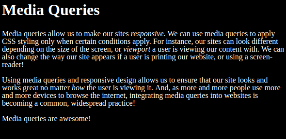
However, as soon as the browser window becomes smaller than 960 pixels the media query is activated. Our background turns black, and our text turns white.

We can use multiple media queries at once to address a wide variety of potential viewport sizes and media types. Let’s add another query to our site:
main.css
@media screen and (max-width: 960px) {
  body {
    background-color: black;
    color: white;
  }
}

@media screen and (max-width: 500px) {
  body {
    background-color: blue;
  }
}
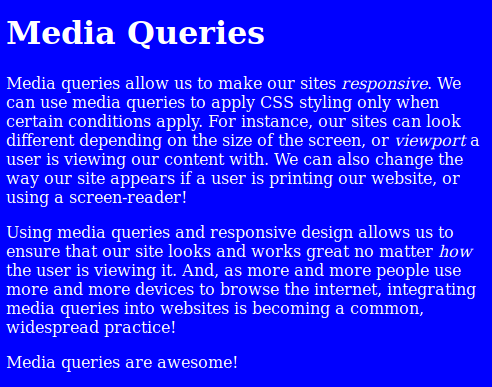
If we refresh our page, we can see it still has a white background if its width is over 960 pixels, and a black background between 960 pixels and 500 pixels. Now, thanks to our second query, our background is blue if the site is fewer than 500 pixels wide.

Did you notice that the text is still white after the background turns blue? This is because the viewport width is still less than 960 pixels. Unless we override the color property with a new property, it will continually remain white.
Sometimes multiple media queries can apply at once. For example, in our media queries above, if a viewport is under 500 pixels both media queries will apply because a size under 500 pixels is under both the maximum width value of 960px and the maximum value of 500px.
When multiple media queries apply, the most-recently applied media query’s CSS will override the other media queries’ CSS if they contain the same selectors and properties. For example, in the example above background-color defined in the first media query is being overridden by the background-color property in our second media query when the viewport is 500 pixels or less in width.
Defining Viewport Ranges
We can also apply both minimum and maximum values to a media query. This can make our css cleaner if we don’t want to worry about multiple media queries applying at once.
We could add a min-width feature to one of our existing queries like this:
main.css
@media screen and (max-width: 960px) and (min-width: 600px) {
  body {
    background-color: black;
    color: white;
  }
}

@media screen and (max-width: 500px) {
  body {
    background-color: blue;
  }
}
Notice that there is another and between the two media features in parenthesis, just like the and between our media type and first media feature. Now, this first query tells our site to apply a black background and white text when the viewport is between 960 and 600 pixels wide.
Now, our site begins with a white background, and no styling applied:

As we reduce the width of its browser window, its background turns black, and text turns white at 960 pixels:

But now, once its width is smaller than 600 pixels (but above the 500px width that will activate another media query), it reverts back to a white background:

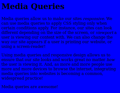
Once it reaches 500 pixels or smaller, it turns blue, but this time with black text:

Also, remember that you can define any CSS in a media query, not just background colors. Oftentimes, sites will display text in multiple columns on larger screens, then collapse into a single column for easier reading on smaller devices.
Let’s create another media query. This time, we’ll use the min prefix on the width feature. We’ll specify that any viewport above 960px should flex our text into columns. This means that any viewport below the size of this breakpoint will display text in a single column:
main.css
@media screen and (min-width: 960px) {
  .row {
    display: flex;
  }

  .row__col {
    width: 300px;
    margin: 0 20px;
  }
}

@media screen and (max-width: 960px) and (min-width: 600px) {
  body {
    background-color: black;
    color: white;
  }
}

@media screen and (max-width: 500px) {
  body {
    background-color: blue;
  }
}
Larger screen sizes see our text in columns:

But if we resize to a smaller viewport, text is collapsed into a single column:

Conclusion
As you can see, media queries are pretty powerful. Depending on which device a user views our site, we can dynamically change what it looks like to appear best. With the increasing number of individuals accessing content on handheld devices and tablets, media queries and responsive design are becoming more important.
As you create websites and applications, you should implement media queries to ensure your content looks great on all devices.
